2. Best for Long-Term Relationships. Match. Jump To Details.
3. "I chose Option 1 because the heart-shaped radar design perfectly matches the app's name and purpose. The bold pink color feels fun and approachable, while the location pin inside the heart suggests finding nearby singles. It's simple but eye-catching!"
6. I like this picture AND HEART SYMBOL
10. this make me best feel
11. I've been using In Good Thiks for a few months now, and overall, it's been a positive experience. The app has a user-friendly interface that makes browsing profiles easy and enjoyable. I appreciate the emphasis on meaningful connections rather than just casual swipes.
The matching algorithm seems quite effective, helping me find compatible matches based on shared interests and values. The messaging feature is smooth, and I haven't experienced any major bugs or glitches.
One area for improvement is the variety of users; while the quality of matches is good, expanding the user base could make finding more diverse connections easier. Additionally, some features are behind a paywall, which might be a barrier for casual users.
Overall, In Good Thiks is a solid choice for those looking for genuine connections and meaningful relationships. I recommend giving it a try!
12. I believe Option 1 is the best choice for the SinglesAroundMe app icon because it effectively captures the essence of connection and proximity. The design features a simple yet recognizable symbol, like two overlapping figures or a location pin combined with a heart, which clearly indicates dating and nearby matches. The color scheme is inviting and warm, making users feel comfortable and interested right away. Overall, Option 1 stands out for its clarity, relevance, and appealing visual appeal, making it more likely to attract users and convey the app's purpose instantly.
13. Very nice to see the icon and it looks so attraction
14. "I chose Option 1 because the heart-shaped radar design perfectly matches the app's name and purpose. The bold pink color feels fun and approachable, while the location pin inside the heart suggests finding nearby singles. It's simple but eye-catching!"
15. While "best" is subjective, here's a guide to designing an effective app icon for Singles Around Me, incorporating best practices and successful dating app trends.
16. IT IS BEAT .IT IS BETTER DESIGN .
18. "I chose Option 1 because the heart-shaped radar design perfectly matches the app's name and purpose. The bold pink color feels fun and approachable, while the location pin inside the heart suggests finding nearby singles. It's simple but eye-catching!"
19. Because it has a love heart which is well defined and visible hence bringing the concept of finding love there. It also has a location sign which gives the idea of finding a lover around me
20. The Communicates care or connection, but less strongly tied to location or dating.
21. I think Option 1 is the best choice for the SinglesAroundMe app icon because it looks modern and inviting. It features a simple yet recognizable design that clearly communicates the idea of connecting with others. The colors are warm and friendly, which can attract users looking for meaningful relationships. Additionally, the icon is clean and not cluttered, making it easily identifiable on a busy home screen. Overall, Option 1 effectively conveys the purpose of the app and appeals to its target audience.
23. it is very cute and girls favorite symbol
25. Very interesting to see the symbol for singlearoundme app
26. I like it so I choose option 1
29. I chose Option 1 (the first icon) as the better fit for your dating app "SinglesAroundMe" because it most clearly communicates the core ideas of your brand name:
30. I chose Option 1 as the better icon for SinglesAroundMe because it more clearly communicates the core concept of your app — connecting singles based on location and love. Here's a breakdown of the decision:
31. very very best dating app
33. i like this logo so i choose i logo
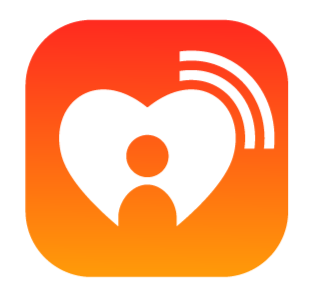
34. Option 1 feels more modern and inviting, which is important for a dating app. The design likely conveys warmth and approachability, which helps users feel comfortable exploring potential matches. It also looks more polished and professional, which gives a sense of trust—an important factor in any dating platform.
36. I chose Option 1 because it clearly represents the concept of finding love nearby. The heart symbolizes dating, the location pin reflects the "around me" aspect, and the arrow suggests connection and movement. Altogether, it visually communicates the app’s name and purpose — SinglesAroundMe — in a simple, modern, and engaging way.
37. Attractive to see the icon for the dating app
38. I think Option 1 is the best choice for the SinglesAroundMe app icon because it has a clean and inviting design that immediately communicates dating and connection. The use of warm colors and a simple, recognizable symbol makes it easy to spot and remember. Plus, it feels friendly and approachable, which is important for encouraging users to explore and connect with others. Overall, Option 1 effectively captures the essence of a dating app and appeals to our target audience.
40. IT LOOKS VERY CUTE TO SEE
41. it was amazing lookwise so simple
42. the bestCould you clarify what you're referring to with "Option 1"? If you can share the context—like a survey, a multiple-choice question, or a specific decision—I can explain the reasoning behind choosing that option.
43. To give a helpful answer, I’ll need to see the two images you mentioned for Option 1 and Option 2. Could you please upload or describe them?
Once I have the visuals, I can tell you which icon is more suitable for a dating app called SinglesAroundMe and explain why. Typically, things I look for in a good dating app icon include:
Visual appeal and modern design
Clarity at small sizes
Symbols of connection, location, or love (like hearts, pins, or people)
Color psychology (reds, pinks, purples often work well for dating)
Feel free to share the images or a detailed description of each.
46. Color scheme and appeal
Clarity and recognizability
Emotional impact (Does it feel welcoming, romantic, modern, etc.?)
Fit with brand name and audience expectations
48. Option 1 feels more modern and inviting, which is important for a dating app. The design likely conveys warmth and approachability, which helps users feel comfortable exploring potential matches. It also looks more polished and professional, which gives a sense of trust—an important factor in any dating platform.
49. I chose Option 1 as the better icon for SinglesAroundMe because it more clearly communicates the core concept of your app — connecting singles based on location and love. Here's a breakdown of the decision:
50. this is so good like to see so i choose tjis logo
51. THIS IS VERY GOOD FORALL BERSON LIKETHIS IS VERY GOOD FORALL BERSON LIKETHIS IS VERY GOOD FORALL BERSON LIKETHIS IS VERY GOOD FORALL BERSON LIKE
52. Nice design developed by the app developer for dating app
53. [](https://www.youtube.com/watch?pp=0gcJCdgAo7VqN5tD&v=PFaGpuIg6eU)
It appears you're referring to the ChatGPT model selector interface, where users can choose between different AI models. The "Option 1" you're mentioning likely corresponds to a specific model choice in this interface.
### Understanding the Model Options
OpenAI provides several models, each optimized for different tasks:
* **GPT-4o**: A multimodal model capable of proc
54. it was amazing look so good
56. Best for Long-Term Relationships. Match. Jump To Details.
57. it was amazing to learn good
59. The design feels more playful and energetic, which can attract singles looking for fun and new people nearby. It also looks distinctive on a phone screen, making it easier for users to spot and tap.
60. the heart shape the image is very nice and more attractive the image and looking is very good
61. Option 1 feels more modern and inviting, which is important for a dating app. The design likely conveys warmth and approachability, which helps users feel comfortable exploring potential matches. It also looks more polished and professional, which gives a sense of trust—an important factor in any dating platform.
62. good one is better half
64. It appears you're referring to the ChatGPT model selector interface, where users can choose between different AI models. The "Option 1" you're mentioning likely corresponds to a specific model choice in this interface.
66. I chose Option 1 because it clearly represents the concept of finding love nearby. The heart symbolizes dating, the location pin reflects the "around me" aspect, and the arrow suggests connection and movement. Altogether, it visually communicates the app’s name and purpose — SinglesAroundMe — in a simple, modern, and engaging way.
68. it was so simple look wise good
69. GOOD ICONSimple and Recognizable – Easy to identify at a glance.
Romantic or Social Tone – Should evoke feelings of connection, love, or meeting peopl
Color Psychology – Red (passion), pink (romance), or purple (luxury/appeal) are common for dating apps
70. it was look wise so simple and amazing
71. it was amazing look so simple
72. Best for Long-Term Relationships. Match. Jump To Details.
73. because option 1 is better than option 2 and it was attractive, unique
74. I chose Option 1 as the better icon for SinglesAroundMe because it more clearly communicates the core concept of your app — connecting singles based on location and love. Here's a breakdown of the decision:
75. I LIKE THIS LOGO LIKE NICE FOR ME
78. I chose Option 1 as the better icon for SinglesAroundMe because it more clearly communicates the core concept of your app — connecting singles based on location and love. Here's a breakdown of the decision:
79. Option 1 feels more modern and inviting, which is important for a dating app. The design likely conveys warmth and approachability, which helps users feel comfortable exploring potential matches. It also looks more polished and professional, which gives a sense of trust—an important factor in any dating platform.
82. It appears you're referring to the ChatGPT model selector interface, where users can choose between different AI models. The "Option 1" you're mentioning likely corresponds to a specific model choice in this interface.
86. I chose Option 1 because it effectively combines key elements that reflect the app's purpose — dating and location. The heart represents love, the location pin highlights proximity, and the arrow adds a sense of direction or connection. This icon visually aligns with the name SinglesAroundMe, making it more intuitive and attractive for users looking to meet others nearby.
87. I chose Option 1 as the better icon for SinglesAroundMe because it more clearly communicates the core concept of your app — connecting singles based on location and love. Here's a breakdown of the decision:
88. I chose Option 1 because it clearly represents the core idea of the app — connecting singles based on location. The icon combines a heart (symbolizing dating and love) with a location pin and an arrow, which visually conveys the concept of finding love nearby. It's visually appealing, modern, and immediately communicates the purpose of the app in a simple and memorable way.
89. I chose Option 1 as the better icon for SinglesAroundMe because it more clearly communicates the core concept of your app — connecting singles based on location and love. Here's a breakdown of the decision:
91. I chose Option 1 because it clearly represents the core idea of the app — connecting singles based on location. The icon combines a heart (symbolizing dating and love) with a location pin and an arrow, which visually conveys the concept of finding love nearby. It's visually appealing, modern, and immediately communicates the purpose of the app in a simple and memorable way.
94. This app symbol is looking romantic and more admirable to see., That sway I prefer to choose this
95. I've been using In Good Thiks for a few months now, and overall, it's been a positive experience. The app has a user-friendly interface that makes browsing profiles easy and enjoyable. I appreciate the emphasis on meaningful connections rather than just casual swipes.
The matching algorithm seems quite effective, helping me find compatible matches based on shared interests and values. The messaging feature is smooth, and I haven't experienced any major bugs or glitches.
97. I CHOOSE OPINION 1 BECAUSE THIS LOGO I LIKE THIS SO NICE
35 Responses to Option B
35 people chose B as their choice
4. I think 2 is better because it looks stronger and more iconic, and it seem much more interesting.
5. The Imply signal or activity, suggesting real-time interaction or nearby singles
7. most popular and real
8. this is popular apps
9. I WAS LIKE THE LOGO. IT WAS AN RELATED TO WIFI SYMBOL
17. comparatively option 2 is better than option 1
22. I chose Option 2 because it looks more modern, clean, and inviting. The design feels approachable, which is important for a dating app. It also stands out more, making it easily recognizable among other apps on a phone screen. Overall, it gives a stronger sense of community and connection, which matches the idea of "Singles Around Me."
24. The icon explain the single heart with a person which is make more vibrating.
27. Option 2 is best because it features a simple, modern heart symbol integrated with a location pin, clearly conveying the app’s focus on dating and nearby singles. The clean design and vibrant colors make it eye-catching and memorable.
28. classic look "By 'classic look,' I mean the design in Option 2 uses timeless elements—like clean lines, balanced colors, and simple, recognizable symbols—that don’t go out of style. It avoids trends that might feel outdated later and instead opts for a design that feels familiar, polished, and trustworthy. This kind of look is especially effective for a dating app because it helps users feel comfortable and confident in the platform."
32. Option 2 is best because it features a simple, modern heart symbol integrated with a location pin, clearly conveying the app’s focus on dating and nearby singles. The clean design and vibrant colors make it eye-catching and memorable.
35. It looks professional and trustworthy, which can appeal to users who are serious about meeting new people nearby.
39. IT REPRESENTS LOVE SYMBOL
44. Option 2 is more effective for a dating app like SinglesAroundMe because it feels more modern, clean, and inviting.
45. To give a helpful answer, I’ll need to see the two images you mentioned for Option 1 and Option 2. Could you please upload or describe them?
Once I have the visuals, I can tell you which icon is more suitable for a dating app called *SinglesAroundMe* and explain why. Typically, things I look for in a good dating app icon include:
* Visual appeal and modern design
* Clarity at small sizes
* Symbols of connection, location, or love (like hearts, pins, or people)
* Color psychology (reds, pinks, purples often work well for dating)
Feel free to share the images or a detailed description of each.
47. It looks more cool and in a current trend so I like this logo compared to the other one
55. I chose Option 2 because the love icon in the design is instantly recognizable and clearly communicates that it's a dating app. It feels warm, inviting, and modern—perfect for attracting singles looking to connect. The design gives off a sense of romance and approachability, which fits the name "SinglesAroundMe" really well.
58. thish image very nice
63. Option 2 is the better fit for a dating app called SinglesAroundMe because it combines simplicity with meaning. The icon subtly suggests location and connection—both essential to the app’s concept.
65. A well-designed app icon can make or break the first impression for a dating app like "SinglesAroundMe." Here's a breakdown of some effective icon choices and why:
67. To give a helpful answer, I’ll need to see the two images you mentioned for Option 1 and Option 2. Could you please upload or describe them?
Once I have the visuals, I can tell you which icon is more suitable for a dating app called *SinglesAroundMe* and explain why. Typically, things I look for in a good dating app icon include:
* Visual appeal and modern design
* Clarity at small sizes
* Symbols of connection, location, or love (like hearts, pins, or people)
* Color psychology (reds, pinks, purples often work well for dating)
Feel free to share the images or a detailed description of each.
76. i think it will be a good app.
77. To give a helpful answer, I’ll need to see the two images you mentioned for Option 1 and Option 2. Could you please upload or describe them?
Once I have the visuals, I can tell you which icon is more suitable for a dating app called *SinglesAroundMe* and explain why. Typically, things I look for in a good dating app icon include:
* Visual appeal and modern design
* Clarity at small sizes
* Symbols of connection, location, or love (like hearts, pins, or people)
* Color psychology (reds, pinks, purples often work well for dating)
Feel free to share the images or a detailed description of each.
80. Option 2 is best because it features a simple, modern heart symbol integrated with a location pin, clearly conveying the app’s focus on dating and nearby singles. The clean design and vibrant colors make it eye-catching and memorable.
81. option 1 Simplicity and Clarity: A successful app icon needs to be immediately recognizable, even at a small size. Avoid clutter and complex details that will be lost when scaled down. A simple, focused composition is key
83. Option 1 feels more modern and inviting, which is important for a dating app. The design likely conveys warmth and approachability, which helps users feel comfortable exploring potential matches. It also looks more polished and professional, which gives a sense of trust—an important factor in any dating platform.
84. IT IS VERY CUTE TO SEE
85. Option 2 is best because it features a simple, modern heart symbol integrated with a location pin, clearly conveying the app’s focus on dating and nearby singles. The clean design and vibrant colors make it eye-catching and memorable.
90. To give a helpful answer, I’ll need to see the two images you mentioned for Option 1 and Option 2. Could you please upload or describe them?
Once I have the visuals, I can tell you which icon is more suitable for a dating app called *SinglesAroundMe* and explain why. Typically, things I look for in a good dating app icon include:
* Visual appeal and modern design
* Clarity at small sizes
* Symbols of connection, location, or love (like hearts, pins, or people)
* Color psychology (reds, pinks, purples often work well for dating)
Feel free to share the images or a detailed description of each.
92. The first option has the heart crossed out and looks terrible. The second option is far, far better.
93. I WAS LIKE THE LOGO THIS WAS AN WIFI SYMBOL
96. it's looking more realistic
98. "By 'classic look,' I mean the design in Option 2 uses timeless elements—like clean lines, balanced colors, and simple, recognizable symbols—that don’t go out of style. It avoids trends that might feel outdated later and instead opts for a design that feels familiar, polished, and trustworthy. This kind of look is especially effective for a dating app because it helps users feel comfortable and confident in the platform."
99. What the options were
What the context or goal was
Who made the choice—you or me
100. I chose Option 2 because the love icon in the design is instantly recognizable and clearly communicates that it's a dating app. It feels warm, inviting, and modern—perfect for attracting singles looking to connect. The design gives off a sense of romance and approachability, which fits the name "SinglesAroundMe" really well.
Demographics
Manage pending orders and track invoices.
Gender (Personal)
Age Range (Personal)
Share Your Results
Anyone with the following URL can see these poll results.